You can feel it before you can name it
You have seen it a hundred times. A video that is technically fine, in focus, decently framed, and yet it just looks... off. Flat. A little cheap. Meanwhile another video of the exact same kind of scene feels like a movie, and you cannot quite say why.
The difference usually is not the camera. It is what happened to the footage after the camera.
What color grading actually is
Professional footage is not shot the way it is shown. We deliberately record in a flat, desaturated profile that looks terrible straight out of the camera: washed out, gray, low contrast. That is intentional. A flat image preserves the maximum amount of information in the highlights and shadows, which gives us full control later.
Then comes the part most people have never seen. First, color correction: balancing every shot so exposure is right, whites are actually white, and skin looks like skin. Then color grading: shaping the corrected image into a look. Warmth in the highlights. Depth in the shadows. Contrast where the story wants weight.
Correction makes footage accurate. Grading makes it feel like something.
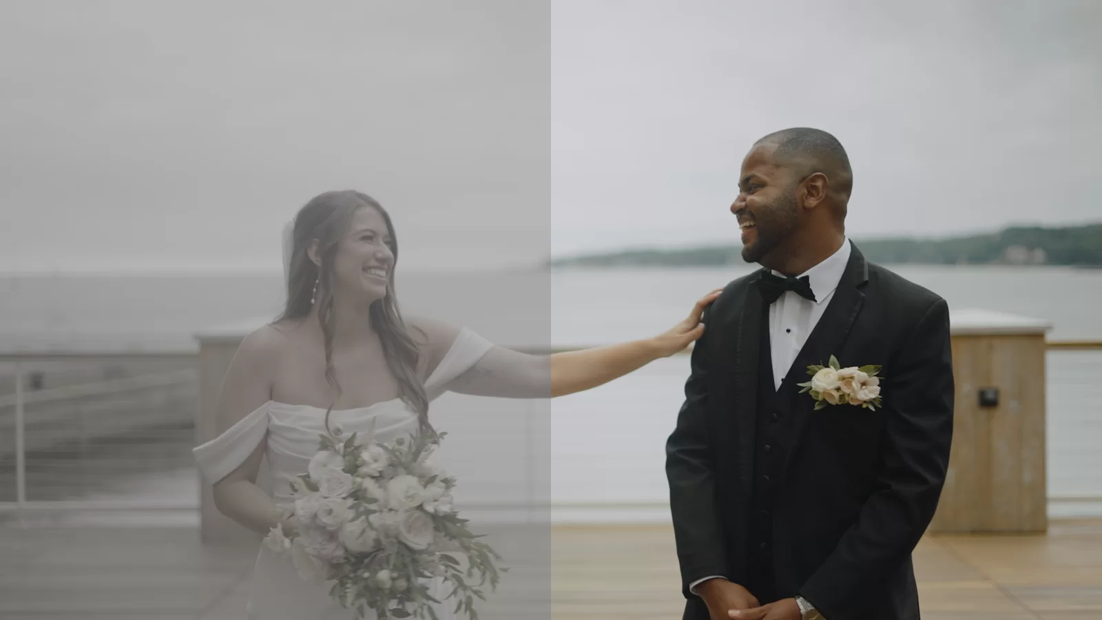
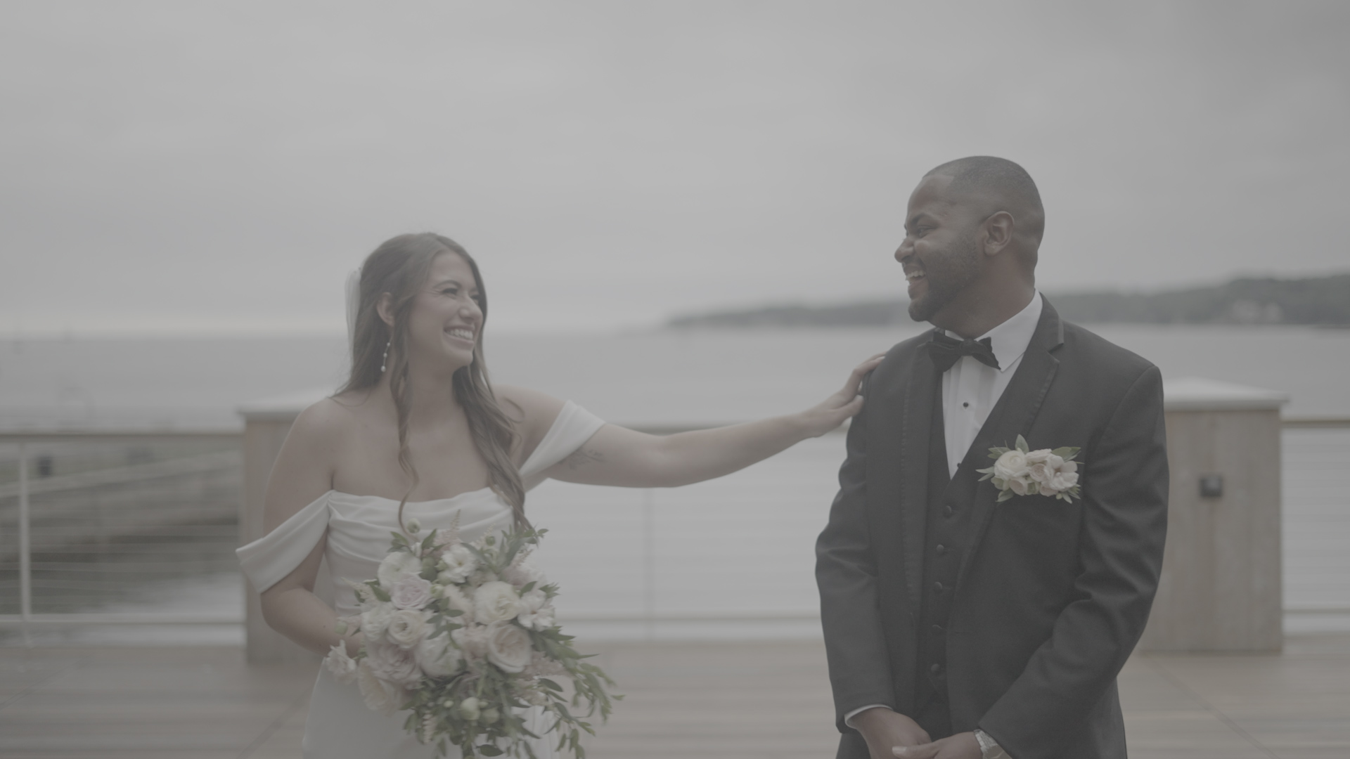 Straight out of camera: flat and desaturated, on purpose.
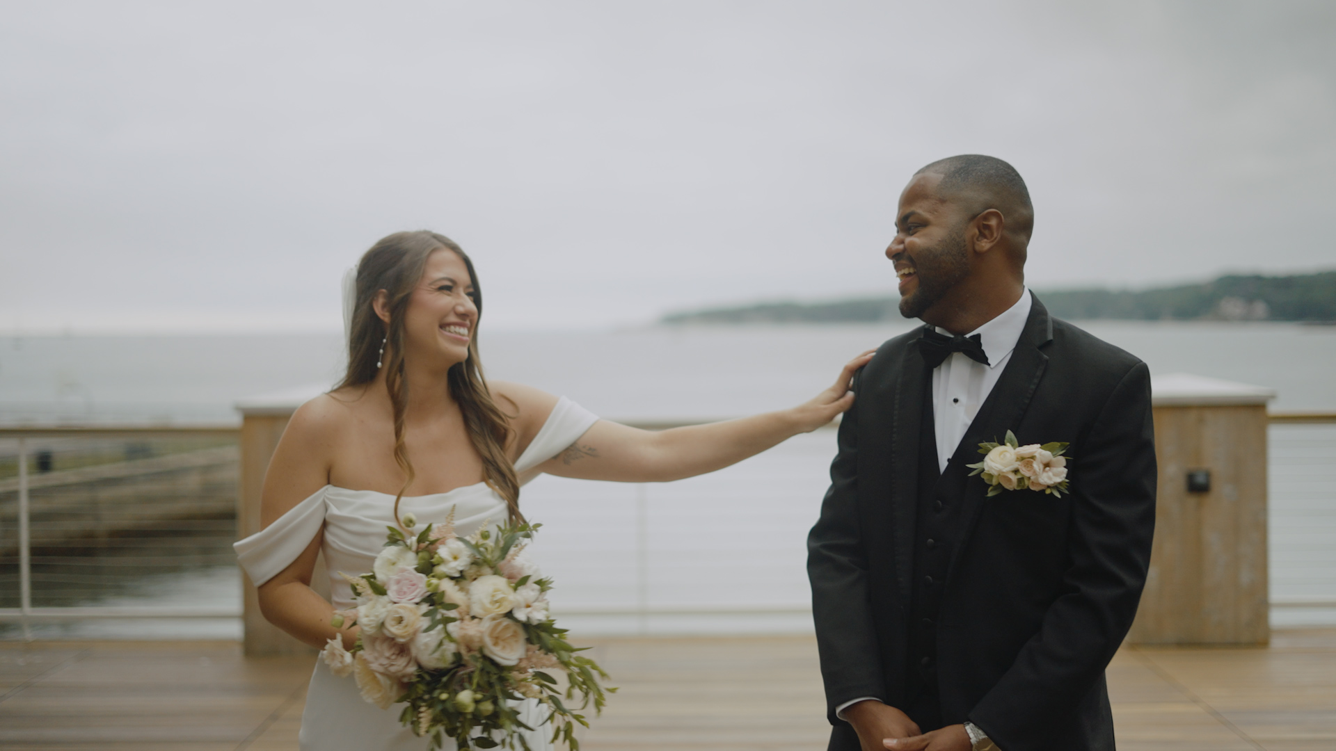 The same frame after the grade. This is the version worth keeping.
Why ungraded video reads as amateur
Your eye is a better critic than you give it credit for. It notices when the ceremony looks cool and blue but the reception suddenly looks orange, because one was lit by daylight and the other by tungsten bulbs and nobody reconciled them. It notices when a face goes slightly green near the DJ's lights. It notices when two cameras covering the same moment disagree about what color the room was.
None of those things register as "bad color" to most viewers. They register as "this looks cheap." The video gets blamed, the camera gets blamed, sometimes the venue lighting gets blamed. It was the grade all along, or the absence of one.
This is also the honest answer to why real post-production takes time. Skipping the grade is one of the ways a vendor hits an impressive delivery date. The export happens fast when nobody is in there reconciling three cameras, a sunset, and a dance floor lit like a spaceship.
Our philosophy: the day, at its best
Some studios grade every film into the same trendy look: teal shadows, orange skin, crushed blacks, regardless of what the day actually looked like. It photographs well on a portfolio page. It also ages like a haircut from 2016.
We grade in a different direction. The goal is the day as it actually felt, rendered at its absolute best. Real skin tones. Candlelight that still glows like candlelight. The romantic half-dark of a first dance kept romantic instead of brightened into a security-camera feed. Contrast and mood are added where the story calls for weight, not because a trend demands it.
The test we hold every frame to: in twenty years, this should still look like your wedding, not like the year it was edited.
What to look for when you evaluate video work
You do not need training to judge a grade. Watch any studio's film and check three things:
- Consistency. Do all the scenes feel like one film, or does the look lurch from shot to shot?
- Skin. Do people look like themselves, or slightly sunburned, or slightly seasick?
- Dark scenes. Does the reception still have atmosphere, or did it turn into noisy gray mush?
If those three hold up, someone cared. If they do not, you have learned exactly how the rest of the work was treated.
Grading is one part of a bigger post-production process we take seriously; the audio side has its own story. And if you want to see our grades on real weddings, the films are in our portfolio. Judge the skin tones yourself.